In our last edition, we highlighted a very active club in
Castro Valley, California. Today, we’ll set our sights northward. Rotary
District 5550 covers a vast range of territory, encompassing the provinces of
Manitoba and Saskatchewan and much of northwestern Ontario.
District 5550 makes excellent use of their ClubRunner site and is a great example of an active Rotary district. Upon landing on their website, your eyes are drawn directly to their banner which is a striking photo of the new Canadian Museum of Human Rights in Winnipeg, a dramatic and vibrant image. By customizing the size of the banner and adding Rotary branding, the overall effect of the image comes through stronger.
District 5550 makes excellent use of their ClubRunner site and is a great example of an active Rotary district. Upon landing on their website, your eyes are drawn directly to their banner which is a striking photo of the new Canadian Museum of Human Rights in Winnipeg, a dramatic and vibrant image. By customizing the size of the banner and adding Rotary branding, the overall effect of the image comes through stronger.
Did you know, you can increase the height of your banner simply by adjusting the pixel count within the Edit Banner page under Banner Height? For best results, keep in mind, that the background image should not exceed 960px in width.
 Notice also how the district has clearly branded their banner with the Rotary wheel showcasing their affiliation to Rotary. Did you know you too can access a wide variety of Rotary-themed logos to use not only in your banner but also throughout your website from the Rotary Images folder in your site's image library, where we've already added official Rotary logos and images.
One of the most important tips to keep in mind for a great website design is that you as the designer have full control of how you want to define a visitors journey on your site. You have to understand who your visitors are, what their motivations are, and then based on that, decide how best to present relevant information, which is easy to access. A great place to start is the navigation menu.
On District 5550's website, you see a well defined navigation menu packed with useful links to information about Rotary International, the District, and the programs undertaken by the clubs within it. It makes effective use of drop-down menus linking to built-in pages and custom content. By categorizing all pages according to subject, they've made it easy for visitors to delve into the history and work of the district. In fact, their menu itself is a great example of what it means to map a user's journey.
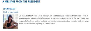
As you continue past the menu, the first thing you see is a
prominent and simple graphic greeting from the District Governor, with a photo attached. They customized this widget
to include an email link to get in touch with the DG directly and a link to the current edition of the newsletter, providing an easy way to read the DG's message without taking up real estate on the main body of the homepage. The use of photos is always a great idea, adding a warm and welcoming touch.
 As you view the remainder of their site, they've made excellent use of custom widgets to display a variety of things which showcase how active the district is, which also helps their website stand out. From the creative use of displaying all 48 clubs within the district on Google Maps to featuring Rotary themes of the month and fundraising events and goals, the addition of graphics opposed simply to text elevates the look of the site.
The use of the sponsors front and center on the right is also ideal especially for their visitor demographic. Fun fact, did you know that western readers typically look at a webpage from left to right, and as such are actually less likely to find the ads to be intrusive, yet intriguing enough to click on should the content of the ad capture their attention.
Scrolling down, you can see their page is a treasure trove of information about both the District and news about the clubs. There are a dozen stories online, and fresh new information seems to be added on a regular basis. This is a good way to keep members informed and draw non-members to their site as a source of information.
Click on the banner image below
to explore their website!


